webdesign/CSS
performance / transition
yunsoo.note
2022. 1. 20. 23:47
css animation : the performance monitor / transition
transition: all; X
transitions are CPU intensive. link
.box {
width:300px;
height: 300px;
background:red;
transition-duration:1000ms;
transition-property:background, transform;
}
.box : hover {
background:blue;
transform:rotate(45deg);
}
transition-timing-function:ease-in;
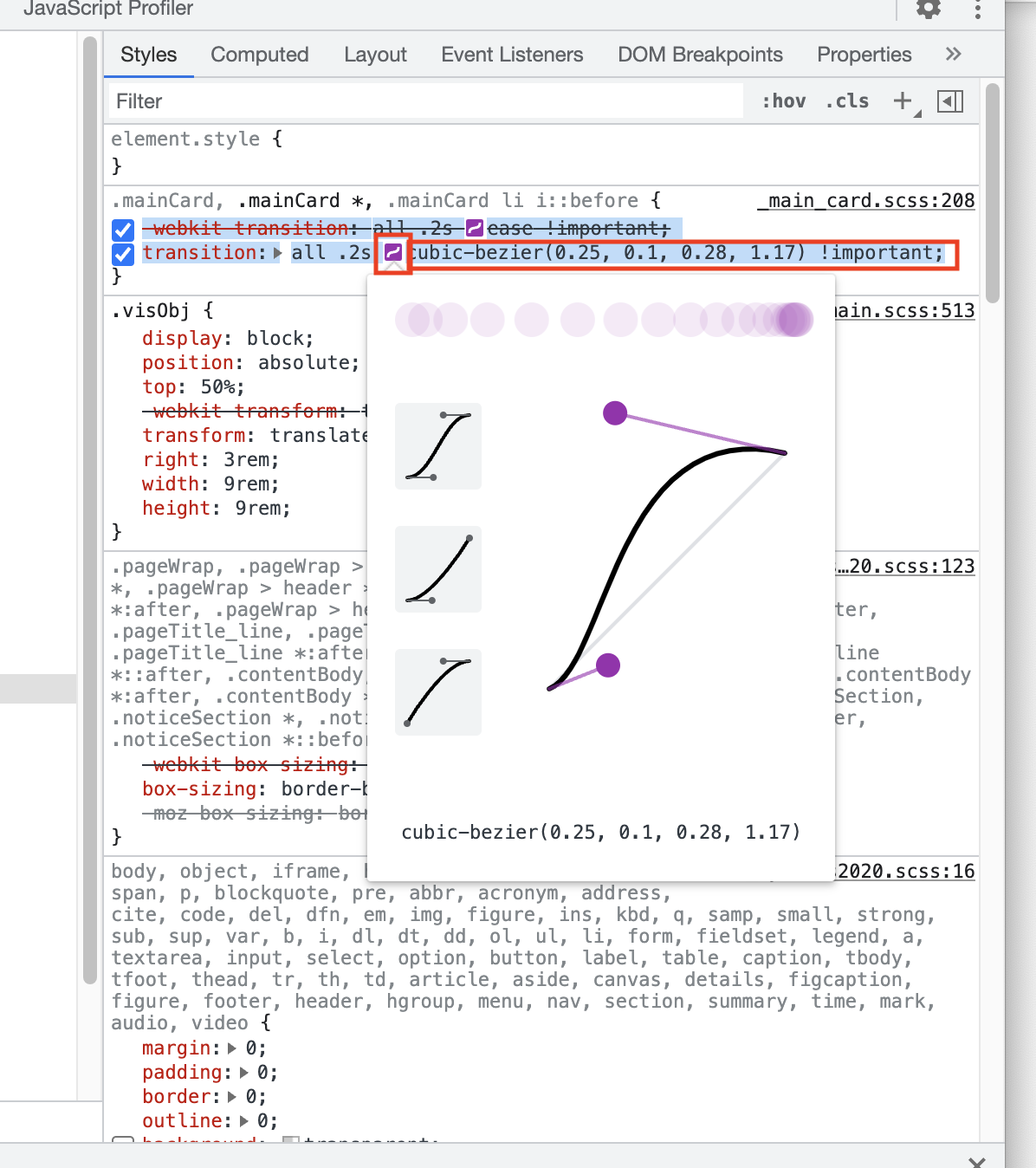
transition-timing-fuction:cubic-bezier(.77,0,.18,1);

Stop animating box-shadows the wrong way! (Kevin Powell's video)
box-shadows vs. 👍 opacity :
opacity doesn't require the page to be repainted.
position vs. 👍 translate :
in a position-changing, it's recreating/repainting the page along the way. (layout)
06:58 - comparing the performance 브라우저에서 퍼포먼스 보기
https://tobiasahlin.com/blog/how-to-animate-box-shadow/
How to animate box-shadow with silky smooth performance
Spoiler-alert: you don't. You use a pseudo-element.
tobiasahlin.com
<img loading="lazy">
개발자 툴 network에서 확인